Hello Mixlr Community,
We’re excited to unveil a series of improvements that will enhance your experience with images across Mixlr. These updates will be rolled out over the coming months, and are designed to simplify how you manage and present your visual content, ensuring a seamless and consistent look across all your channels, events, recordings, collections, and RSS feeds. Read on for more:
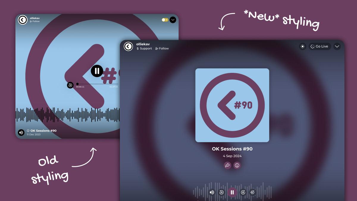
What’s New
Our goal with these updates is to streamline the image handling process for creators, making it easier and more intuitive to upload and manage images. Here’s a breakdown of what’s going to change:
Unified Image Format
- Square Images: We’re standardizing all artwork to a square format. This means you’ll be able to use the same image size across your Channel, Events, Recordings, Collections, and RSS feeds. No more guessing what dimensions to use – just one simple format for everything.
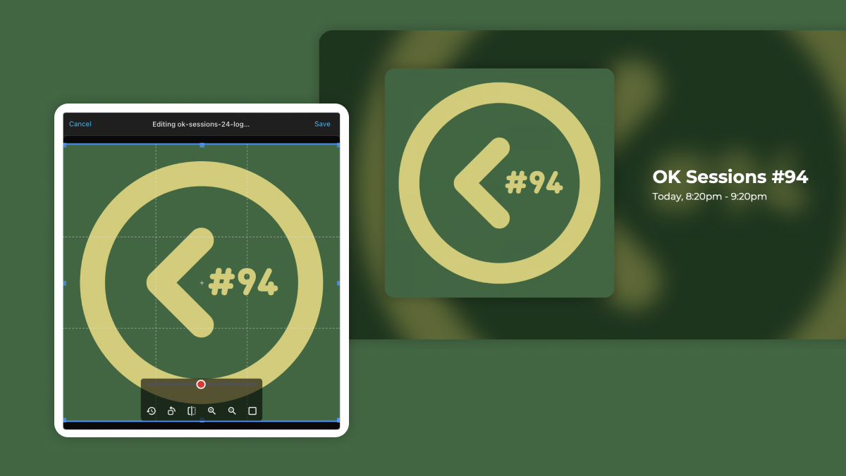
Enhanced Image Uploading
- New Image Uploader: Whenever you add an image to your content, you’ll soon see a new image uploader. This tool allows you to crop, zoom, and rotate your images within a square box, giving you full control over how your images appear.
- Primary Color Detection: When you upload an image, we will automatically detect the primary color and store it against the Event, Recording, or Collection. This color will be used for card styles (and can be overridden if desired in a future release).
Updated Styling
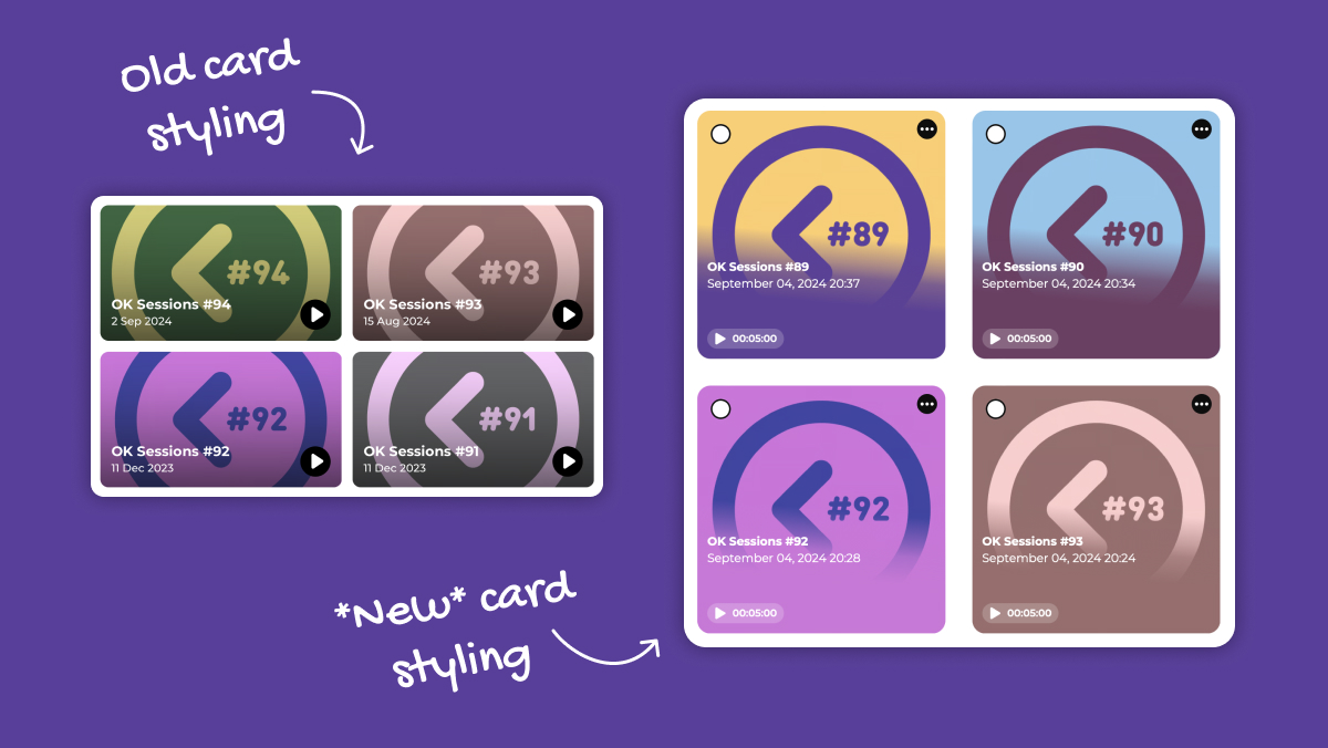
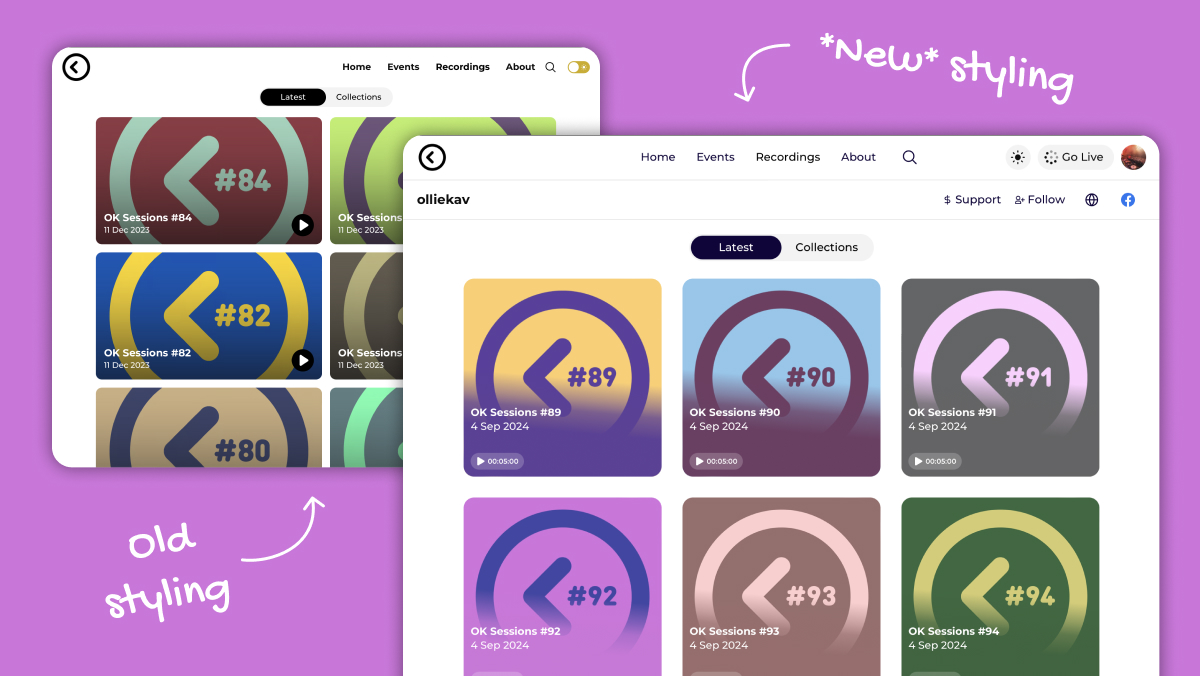
- Card Styling: You’ll see an update to how your Event, Recording, and Collection cards are styled across Mixlr.com, Mixlr apps and in your Creator’s Space to support the new square images.
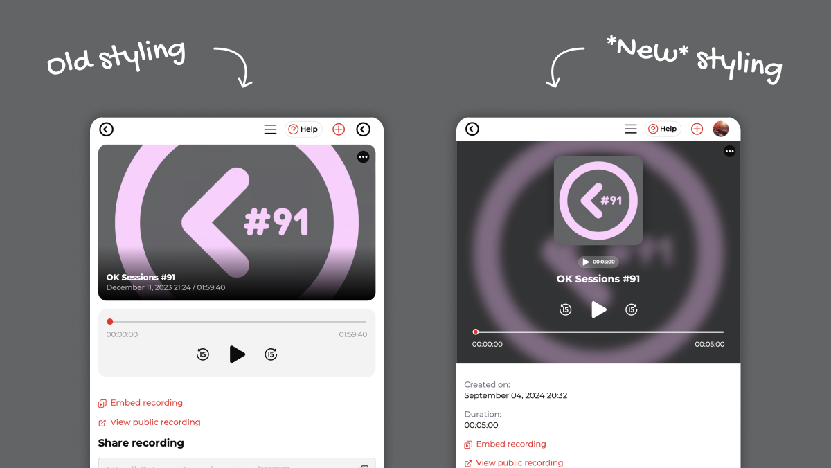
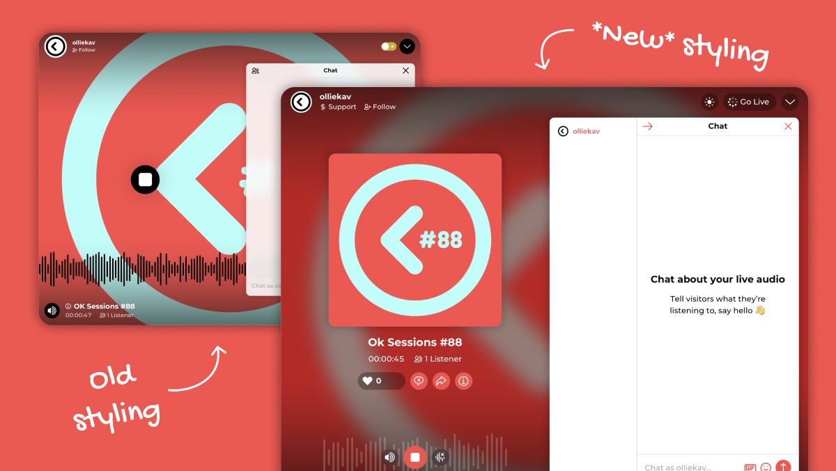
- Event, Recordings and Collections: The pages for Events, Recordings, and Collections themselves will also be updated to support the new square images, offering a more cohesive and visually appealing layout throughout.
Channel Enhancements
- Simplified Navigation: We’re updating the homepage menu to simplify navigation, making it easier for your listeners to find the content they want.
- Support for Square Images: These changes will apply to various parts of the channel, including the homepage, full-screen player, Events list page, Recordings list page, search, and Collections.
Creator and Listener Apps
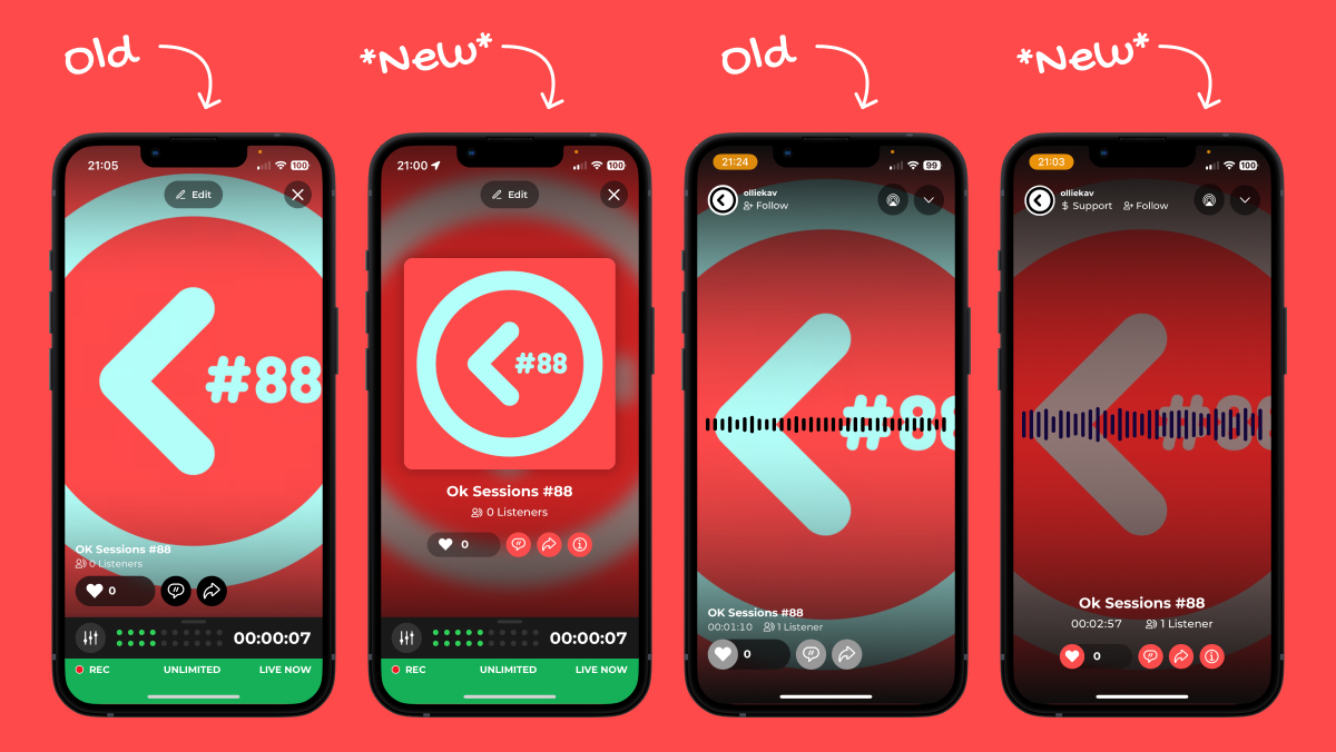
- Creator Apps: Built to support the square images without any issues, and will automatically update with the new card styles.
- Listener Apps: The homepage and list views in the listener apps will be updated with the new card styling. The playback view retains full-screen backgrounds with slight adjustments to control positions.
Embed Player
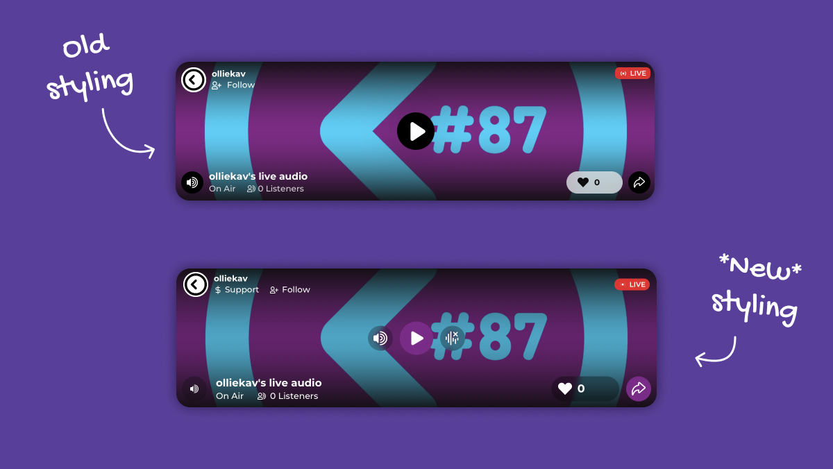
- While the embed player will keep the full backgrounds for now, you’ll also see some layout tweaks to ensure a better user experience.
Why You’ll Love These Changes
- Consistency: A unified image format means a consistent look and feel across all your content, enhancing the visual appeal of your Channel.
- Ease of Use: The new image uploader simplifies the process of adding and editing images, saving you time and effort.
- Enhanced Visuals: Automatic primary color detection ensures your cards and detail pages always look polished and professional.
Getting Started
The new tools and formats will be rolled out in the coming months, and are ready to make your experience smoother and more visually cohesive.
We’re excited to see how these updates will enhance your content and engagement on Mixlr. As always, your feedback is crucial, so let us know how these changes are working for you and how we can continue to improve your experience.
Enjoy creating,
The Mixlr Team
